http://www.davidsongalleries.com/subjects/american/sterner-29343.jpg
Albert Sterner was an American artist, although he was born in London in 1863. He began studying art in his teenage years, mainly drawing. Sterner lived all over the world, born in London, moved to Germany, then to the United States where he lived in Chicago and New York, and then moved back to Europe. He played a significant role as an illustrator, but he also produced lithographs, oil paintings, water color paintings, and drawings. Sterner also found work in painting theater scenery and printmaking. He died at age 83 in 1946.
“Seated Nude” is a lithograph done by Sterner in sepia, which is different from the typical black and white. This piece is very plain and simple, and depicts a nude woman that seems to be sitting on a bed. It is difficult to tell whether or not she is getting into bed or if she is getting out of bed. Her back is towards us, but it is as if she is twisted away. We cannot see her face, but we see her long hair that is almost half-way down her back. She looks very delicate with the way she is still softly on the bed. Her head is tilted downward and her hand is resting on her leg.
The only shading that exists in the picture is done very limitedly, but it helps make the woman look more voluminous. She is an average-sized woman and seems to be very beautiful and womanly. The fact that we cannot see her face, however, makes her almost mysterious. Once again, this artist leaves the imagination and interpretation open to the viewer by keeping the image simple, yet suggestive in many ways.
I like the simplicity of this image and how the artist is skilled to use few lines, but still make a beautiful piece of work. His use of lines depicts the sheets, crumpled at the edge of the bed and the suggestion on a pillow near her back. He also portrayed the woman as imperfect, but perfect at the same time. Although she is not petite or super thin, she is still beautiful and womanly, with curves and a very womanly figure.
Friday, April 30, 2010

ChArLeS LoCkE
http://www.oldprintshop.com/images/large/29512.jpg
Charles Locke was born in 1899 in Cincinnati, Ohio. Locke began studying art at a young age, and had many pupils who became successful artists as well. A great deal of his work had an urban genre, depicting bar scenes and many different portraits. Although drawing was his specialty, Locke also worked in illustration, etching, lithography, and teaching drawing. He died in New York in 1983, but was very well known, even during his lifetime.
The reason Locke’s works caught my eye was because there seemed to be a common trend that he followed, capturing people in their everyday lives, whether they be eating, thinking, shopping, or working. The one that I really like was “A la Carte,” which depicted a man at a restaurant. He is sitting by himself and has a bowl of soup, a piece of bread and a glass of wine. The table seems very small, almost too small. He is in the corner of the room, almost secluded. From this image, I would assume this is a man who is comfortable going to eat by himself, and maybe he does this regularly.
The seat across from him remains empty, but he is too focused on what he is reading to even seem to notice. He has an intense look on his face as he reads whatever it is he is reading. Locke seems to have a very soft style to his work. There are a few harsh lines, but they do not overwhelm the work. This softness, I believe, adds to the comfortableness of the image. Although this looks to be a small space with a small table and a man who is eating by himself, Locke is able to make the viewer feel comfortable, which is a great accomplishment.
I like that Locke chose simple things to portray in his work, but he still kept them exquisite. Even this simple portrayal of a man eating alone in a restaurant leaves the viewers imagination and interpretation of the work open.
Charles Locke was born in 1899 in Cincinnati, Ohio. Locke began studying art at a young age, and had many pupils who became successful artists as well. A great deal of his work had an urban genre, depicting bar scenes and many different portraits. Although drawing was his specialty, Locke also worked in illustration, etching, lithography, and teaching drawing. He died in New York in 1983, but was very well known, even during his lifetime.
The reason Locke’s works caught my eye was because there seemed to be a common trend that he followed, capturing people in their everyday lives, whether they be eating, thinking, shopping, or working. The one that I really like was “A la Carte,” which depicted a man at a restaurant. He is sitting by himself and has a bowl of soup, a piece of bread and a glass of wine. The table seems very small, almost too small. He is in the corner of the room, almost secluded. From this image, I would assume this is a man who is comfortable going to eat by himself, and maybe he does this regularly.
The seat across from him remains empty, but he is too focused on what he is reading to even seem to notice. He has an intense look on his face as he reads whatever it is he is reading. Locke seems to have a very soft style to his work. There are a few harsh lines, but they do not overwhelm the work. This softness, I believe, adds to the comfortableness of the image. Although this looks to be a small space with a small table and a man who is eating by himself, Locke is able to make the viewer feel comfortable, which is a great accomplishment.
I like that Locke chose simple things to portray in his work, but he still kept them exquisite. Even this simple portrayal of a man eating alone in a restaurant leaves the viewers imagination and interpretation of the work open.
Stow Wengnroth
http://images.google.com/imgres?imgurl=http://www.davidsongalleries.com/subjects/american/wengeroth_28068.jpg&imgrefurl=http://www.davidsongalleries.com/subjects/american/american.php&usg=__avJBBxbrGQKLdWqKILmn5uSTVHA=&h=475&w=735&sz=191&hl=en&start=17&um=1&itbs=1&tbnid=Nu9OyOwzuMUt0M:&tbnh=91&tbnw=141&prev=/images%3Fq%3DStow%2BWengenroth%26um%3D1%26hl%3Den%26sa%3DN%26tbs%3Disch:1
Stow Wengenroth was once referred to as “America’s greatest living artist working in black and white.” Wengenroth was born in Brooklyn, New York in 1906. He became a very well known artist and lithographer, considered one of the best lithographers of the twentieth century. Wengenroth became most known for his detailed depictions of seascapes and landscapes, focusing a great deal on shadow, light and form.
All of the works done by Wengenroth that I saw were extremely detailed and fascinating. After looking at his works and taking the class, I can appreciate all of the work that must have gone into each and every one of his works in order to be so detailed and particular.
One of his works that caught my eye was “Cape Ann Willows.” I am a sucker for a beautiful landscape and I believe Wengenroth successfully captures the natural beauty of the trees and their movement as they sit near a small stream. The trees take up most of the work, but do not overwhelm it. There is movement portrayed through the grass and plants near the water. Off in the distance, there is a light house and what looks to be a house next to it. It looks as if just beyond the trees is the ocean, with the lighthouse sitting to warn boats and ships of the land while traveling at night.
Like I said, I am a sucker for a beautiful landscape. I also love lighthouses so I thoroughly enjoy this work. I am astounded at how someone has the ability to produce a lithograph like this. Unlike some of the more sketchy works, this looks very realistic and captures the beauty that lies in this natural setting.
Stow Wengenroth was once referred to as “America’s greatest living artist working in black and white.” Wengenroth was born in Brooklyn, New York in 1906. He became a very well known artist and lithographer, considered one of the best lithographers of the twentieth century. Wengenroth became most known for his detailed depictions of seascapes and landscapes, focusing a great deal on shadow, light and form.
All of the works done by Wengenroth that I saw were extremely detailed and fascinating. After looking at his works and taking the class, I can appreciate all of the work that must have gone into each and every one of his works in order to be so detailed and particular.
One of his works that caught my eye was “Cape Ann Willows.” I am a sucker for a beautiful landscape and I believe Wengenroth successfully captures the natural beauty of the trees and their movement as they sit near a small stream. The trees take up most of the work, but do not overwhelm it. There is movement portrayed through the grass and plants near the water. Off in the distance, there is a light house and what looks to be a house next to it. It looks as if just beyond the trees is the ocean, with the lighthouse sitting to warn boats and ships of the land while traveling at night.
Like I said, I am a sucker for a beautiful landscape. I also love lighthouses so I thoroughly enjoy this work. I am astounded at how someone has the ability to produce a lithograph like this. Unlike some of the more sketchy works, this looks very realistic and captures the beauty that lies in this natural setting.
Oilon Redon
http://images.google.com/imgres?imgurl=http://xroads.virginia.edu/~museum/armory/galleryK/K_229_308.4.b.jpg&imgrefurl=http://xroads.virginia.edu/~museum/armory/galleryK/redon.308.4.html&usg=__EbcxXmQcCTmu8gw9OeCe2KuSwAI=&h=422&w=369&sz=49&hl=en&start=1&um=1&itbs=1&tbnid=uxTN3ZbcRJ-liM:&tbnh=126&tbnw=110&prev=/images%3Fq%3Dodilon%2Bredon%2Bpegasus%2Bcaptive%26um%3D1%26hl%3Den%26tbs%3Disch:1
Odilon Redon was born in 1840 in France to a very successful family. Redon’s artistic talents were visible at a young age. Although he wanted to pursue an education in drawing, he switched to architecture in effort to appease his father; however, his inability to pass the entrance exams crushed any hopes of a career in architecture. Redon not only studied drawing, but he began to study sculpture, etching, and lithography. He took a break from his work to serve in the Franco-Prussian War and then moved to Paris, where he worked mainly with charcoal and lithography. Redon’s work also evolved to using oils and pastels. Unlike some artists, Redon became very well-known for his works during his lifetime. After a successful life and career, he died in 1916.
In 1889, Redon completed a lithograph entitled “Pegasus Captive.” The work is overall very dark and eerie. The Pegasus portrayed in the image is the darkest part of the work. It has its head tilted down, as if surrendering or it could be in sadness. There is a faint suggestion of a wing, showing that this is not just any normal horse. It seems to be as if a man has the Pegasus in his possession; however, the body position of the man suggests fatigue or maybe again sadness. His head, too, is tilted downward so it is hard to tell what the man is actually feeling.
The lines of this lithograph are very sketchy, giving this work a very suggestive nature. The tone of the work seems to be darker, sadder, almost fatigued. The image goes from dark in the bottom corner to light near the top, but it is still difficult to tell if this is happening during the day or in the evening.
I enjoy this lithograph a great deal. I really like the sketchiness of it, and the suggestive lines that creates the tone of the work. I question, though, what the original drawing on the stone looked like, based on the work we have been doing in class and how drastically the works seem to change once printed onto the paper.
Odilon Redon was born in 1840 in France to a very successful family. Redon’s artistic talents were visible at a young age. Although he wanted to pursue an education in drawing, he switched to architecture in effort to appease his father; however, his inability to pass the entrance exams crushed any hopes of a career in architecture. Redon not only studied drawing, but he began to study sculpture, etching, and lithography. He took a break from his work to serve in the Franco-Prussian War and then moved to Paris, where he worked mainly with charcoal and lithography. Redon’s work also evolved to using oils and pastels. Unlike some artists, Redon became very well-known for his works during his lifetime. After a successful life and career, he died in 1916.
In 1889, Redon completed a lithograph entitled “Pegasus Captive.” The work is overall very dark and eerie. The Pegasus portrayed in the image is the darkest part of the work. It has its head tilted down, as if surrendering or it could be in sadness. There is a faint suggestion of a wing, showing that this is not just any normal horse. It seems to be as if a man has the Pegasus in his possession; however, the body position of the man suggests fatigue or maybe again sadness. His head, too, is tilted downward so it is hard to tell what the man is actually feeling.
The lines of this lithograph are very sketchy, giving this work a very suggestive nature. The tone of the work seems to be darker, sadder, almost fatigued. The image goes from dark in the bottom corner to light near the top, but it is still difficult to tell if this is happening during the day or in the evening.
I enjoy this lithograph a great deal. I really like the sketchiness of it, and the suggestive lines that creates the tone of the work. I question, though, what the original drawing on the stone looked like, based on the work we have been doing in class and how drastically the works seem to change once printed onto the paper.
Thursday, March 18, 2010
BlAcKBuRn
http://newdeal.feri.org/magpie/images/dwc063.htm (Refugees)
Robert Hamilton Blackburn is an African American artist born in 1920 in Summit, New Jersey. Blackburn is most well-known for his mod imagery printmaking, as well as being an educator. He died in 2003 in New York where he spent most of his life. He was an art educator and lecturer at Columbia University, Cooper Union Art School, New York School for Social Research, and School of the Visual Arts (New York).
During his lifetime, Blackburn was awarded with the MacArthur Foundation Fellowship and the Whitney Fellowship. His methods included easel painting and printmaking., but his is most known for his development of abstract color lithography. Overtime, his art has been on display at the Boston Museum of Fine Arts, the Brooklyn Museum, the Pennsylvania Academy of Fine Arts, and the Whitney Museum of Fine Arts.
Blackburn’s piece, Refugees, is a lithograph that depicts a very tiny, overcrowded boat of men covered in darkened shadows. The image is dark and dreary, allowing the viewer to assume it is night time and this boat is an escape mechanism for the people in it. One man is hanging over the side of the boat, possibly because he is sick from the cramped, tiny rowboat. Another man, at the head of the boat, is rowing, but has his head down, which could infer exhaustion or even sadness. He may be leaving behind family and friends in order to escape his past life.
The water is full of ripples from the rowboat, but still seems smooth. Upon viewing this, I could imagine the small boat gliding through the water, producing no sound, except for when the paddles enter the water and the sound of droplets hitting the water as the oar comes up out of the water. Because of the title, I can guess these men are escaping from somewhere, but I do not know where. The sky is ominous, but may be that way to allow the viewer to feel the emotions of the refugees in the boat. There is sadness, but hope.
In this image, Blackburn is depicting the social issue of refugees and what they must go through to get to a better life. This is not a happy image by any means. It produces a sense of sadness, but could foster a sense of hope for what lies ahead.
http://www.askart.com/AskART/artists/search/ArtistKeywords.aspx?artist=63427
Robert Hamilton Blackburn is an African American artist born in 1920 in Summit, New Jersey. Blackburn is most well-known for his mod imagery printmaking, as well as being an educator. He died in 2003 in New York where he spent most of his life. He was an art educator and lecturer at Columbia University, Cooper Union Art School, New York School for Social Research, and School of the Visual Arts (New York).
During his lifetime, Blackburn was awarded with the MacArthur Foundation Fellowship and the Whitney Fellowship. His methods included easel painting and printmaking., but his is most known for his development of abstract color lithography. Overtime, his art has been on display at the Boston Museum of Fine Arts, the Brooklyn Museum, the Pennsylvania Academy of Fine Arts, and the Whitney Museum of Fine Arts.
Blackburn’s piece, Refugees, is a lithograph that depicts a very tiny, overcrowded boat of men covered in darkened shadows. The image is dark and dreary, allowing the viewer to assume it is night time and this boat is an escape mechanism for the people in it. One man is hanging over the side of the boat, possibly because he is sick from the cramped, tiny rowboat. Another man, at the head of the boat, is rowing, but has his head down, which could infer exhaustion or even sadness. He may be leaving behind family and friends in order to escape his past life.
The water is full of ripples from the rowboat, but still seems smooth. Upon viewing this, I could imagine the small boat gliding through the water, producing no sound, except for when the paddles enter the water and the sound of droplets hitting the water as the oar comes up out of the water. Because of the title, I can guess these men are escaping from somewhere, but I do not know where. The sky is ominous, but may be that way to allow the viewer to feel the emotions of the refugees in the boat. There is sadness, but hope.
In this image, Blackburn is depicting the social issue of refugees and what they must go through to get to a better life. This is not a happy image by any means. It produces a sense of sadness, but could foster a sense of hope for what lies ahead.
http://www.askart.com/AskART/artists/search/ArtistKeywords.aspx?artist=63427
Thursday, February 18, 2010
Goya
https://my.hamilton.edu/images/general/teacher5big.jpg
Francisco de Goya was one of the other print makers discussed in class who made bold statements through his works. Goya was born in March 1746 in Spain and died in April 1828. He is considered to be “The Father of Modern Art.” What set Goya apart from the other painters and print makers of the time was that he was not shy at expressing what he felt. He worked at taking the previous reactions that art caused and created a new form, incorporating components into his art that would get a different type of reaction. Goya spent 82 years producing art, leading to some of the most expressive works of his time.
As a young boy, it was said that Goya was happy with the world. It was not until he entered adulthood in which he began to criticize society as a whole. Later toward the end of his life, it was said that he was embittered and disillusioned by both people and society. Goya’s art tended to lean more towards the Romantic expression, but still incorporated some of the classical style. He tended to depict the social and political implications of Spain, including the Napoleonic War. It was his graphic expression through art that made him the well-known print maker he is to this day.
The above work by Goya is an etching, entitled Hunting for Teeth. In the image, there is a woman attempting to pull the teeth out of a dead man’s mouth who was recently hung. She is shielding her face away from his with a cloth, which may be due to the stench, or to keep herself from having to look at the dead man’s face. It could also represent the idea that she is shameful of what she is doing, but feels the impulse to do it anyways. This was one of the superstitions of the time in Spain. It was thought that if you pulling out the teeth of a hanged man provided a type of power.
It can also be thought that the woman is covering her face because she is fearful of looking at a dead man. She, however much like society, is greedy and removes his teeth. Other ideas describe the fact that a hanged man’s teeth can be used in magic potions. The art piece also utilizes the technique of aquatint. Overall, it is a very grey, dark image, which may suggest this is taking place at night. The dead man is the lightest part of the image. The woman is trying to look away while still being able to see what she is doing, with somewhat of a side ward glance. The man, we may assume, was hanged because of a crime against the government.
Goya depicts two different types of people in the image. He has the criminal, or man who was hanged due to some sort of crime, and he has the greedy woman who is stealing the man’s teeth. Overall, Goya is representing people in society and their actions. The fact that Goya depicts things such as is this is what set him apart from other artists. He did not portray picnics, or sunsets, but instead real issues plaguing society at the time.
http://www.imageone.com/goya/
Francisco de Goya was one of the other print makers discussed in class who made bold statements through his works. Goya was born in March 1746 in Spain and died in April 1828. He is considered to be “The Father of Modern Art.” What set Goya apart from the other painters and print makers of the time was that he was not shy at expressing what he felt. He worked at taking the previous reactions that art caused and created a new form, incorporating components into his art that would get a different type of reaction. Goya spent 82 years producing art, leading to some of the most expressive works of his time.
As a young boy, it was said that Goya was happy with the world. It was not until he entered adulthood in which he began to criticize society as a whole. Later toward the end of his life, it was said that he was embittered and disillusioned by both people and society. Goya’s art tended to lean more towards the Romantic expression, but still incorporated some of the classical style. He tended to depict the social and political implications of Spain, including the Napoleonic War. It was his graphic expression through art that made him the well-known print maker he is to this day.
The above work by Goya is an etching, entitled Hunting for Teeth. In the image, there is a woman attempting to pull the teeth out of a dead man’s mouth who was recently hung. She is shielding her face away from his with a cloth, which may be due to the stench, or to keep herself from having to look at the dead man’s face. It could also represent the idea that she is shameful of what she is doing, but feels the impulse to do it anyways. This was one of the superstitions of the time in Spain. It was thought that if you pulling out the teeth of a hanged man provided a type of power.
It can also be thought that the woman is covering her face because she is fearful of looking at a dead man. She, however much like society, is greedy and removes his teeth. Other ideas describe the fact that a hanged man’s teeth can be used in magic potions. The art piece also utilizes the technique of aquatint. Overall, it is a very grey, dark image, which may suggest this is taking place at night. The dead man is the lightest part of the image. The woman is trying to look away while still being able to see what she is doing, with somewhat of a side ward glance. The man, we may assume, was hanged because of a crime against the government.
Goya depicts two different types of people in the image. He has the criminal, or man who was hanged due to some sort of crime, and he has the greedy woman who is stealing the man’s teeth. Overall, Goya is representing people in society and their actions. The fact that Goya depicts things such as is this is what set him apart from other artists. He did not portray picnics, or sunsets, but instead real issues plaguing society at the time.
http://www.imageone.com/goya/
Saturday, February 13, 2010
Rauschenberg
http://www.djtfineart.com/images/artwork/full/art00553.jpg
Robert Rauschenberg was born in Port Arthur, Texas in 1925. Through out his life, Rauschenberg went many different directions in regards to his professional life. He studied pharmacy at the University of Texas. After some time he joined the U.S. Marines and then took classes at the Kansas Art Institute. Later he studied in Paris, France where he also met his wife, Susan Weil. He continued to study art in various locations and with many different artists, composers, and others in the artistic realm. While studying art, he mainly worked coordinating window displays for companies like Tiffany.
Rauschenberg spent some time working on all black and white paintings, but began using red when he moved to New York. He also created what became known as Combines, which were combinations of everyday objects fused together in both painting and sculpture. Rauschenberg incorporated a great deal of highly influential historical events into his work. One of those events was the liftoff of Apollo 11, which he was invited to by NASA as one of the themes of his artwork.
Besides his influence on the pop art movement, Rauschenberg found it in himself to help other struggling artists in the area, setting up Change, Inc., which was a home set up with art studios. Rauschenberg found time to travel the world and promote both peace and understanding through his art. He traveled to Mexico, Chile, Venezuela, China, Tibet, Japan, Cuba, the Soviet Union, Berlin, and Malaysia where he set up his exhibitions. He called this ROCI – for Rauschenberg’s Overseas Culture Interchange. His exhibition was also held at the National Gallery of Art in celebration of the gallery’s 50th anniversary.
Although he used many different techniques, one that Rauschenberg is more well-known for is his lithographic works. The above work is a lithograph entitled “Back Out” that was completed in 1979. He completed this work in a suite of 9 prints. The techniques used included pencil, stencil, and collage. There are many different pictures put into this work, one of a baseball player, and another of a high jumper. As for the overall meaning or purpose of the work, I am not really sure what he is trying to convey. I can assume that this work is about the United States, possibly alluding to sports culture.
To me, more important that the techniques of his work and his major accomplishments or awards, Rauschenberg was an artist that was committed to a cause. He spent a great deal of time working on art with a great deal of meaning. Through his art pieces, his work was used to communicate peace and understanding all over the world. Personally, I felt like class on Thursday was very beneficial, and would be beneficial to any person with an artistic inclination. I feel more of a personal investment toward my art and will try to use the type of communication that my art allows me.
http://www.getpopart.com/Rauschenberg-Bio.html
www.nga.gov
Robert Rauschenberg was born in Port Arthur, Texas in 1925. Through out his life, Rauschenberg went many different directions in regards to his professional life. He studied pharmacy at the University of Texas. After some time he joined the U.S. Marines and then took classes at the Kansas Art Institute. Later he studied in Paris, France where he also met his wife, Susan Weil. He continued to study art in various locations and with many different artists, composers, and others in the artistic realm. While studying art, he mainly worked coordinating window displays for companies like Tiffany.
Rauschenberg spent some time working on all black and white paintings, but began using red when he moved to New York. He also created what became known as Combines, which were combinations of everyday objects fused together in both painting and sculpture. Rauschenberg incorporated a great deal of highly influential historical events into his work. One of those events was the liftoff of Apollo 11, which he was invited to by NASA as one of the themes of his artwork.
Besides his influence on the pop art movement, Rauschenberg found it in himself to help other struggling artists in the area, setting up Change, Inc., which was a home set up with art studios. Rauschenberg found time to travel the world and promote both peace and understanding through his art. He traveled to Mexico, Chile, Venezuela, China, Tibet, Japan, Cuba, the Soviet Union, Berlin, and Malaysia where he set up his exhibitions. He called this ROCI – for Rauschenberg’s Overseas Culture Interchange. His exhibition was also held at the National Gallery of Art in celebration of the gallery’s 50th anniversary.
Although he used many different techniques, one that Rauschenberg is more well-known for is his lithographic works. The above work is a lithograph entitled “Back Out” that was completed in 1979. He completed this work in a suite of 9 prints. The techniques used included pencil, stencil, and collage. There are many different pictures put into this work, one of a baseball player, and another of a high jumper. As for the overall meaning or purpose of the work, I am not really sure what he is trying to convey. I can assume that this work is about the United States, possibly alluding to sports culture.
To me, more important that the techniques of his work and his major accomplishments or awards, Rauschenberg was an artist that was committed to a cause. He spent a great deal of time working on art with a great deal of meaning. Through his art pieces, his work was used to communicate peace and understanding all over the world. Personally, I felt like class on Thursday was very beneficial, and would be beneficial to any person with an artistic inclination. I feel more of a personal investment toward my art and will try to use the type of communication that my art allows me.
http://www.getpopart.com/Rauschenberg-Bio.html
www.nga.gov
Tuesday, January 26, 2010
M. C. Escher
Links to Images:
http://designingquests.com/blog/wp-content/uploads/2008/11/escher-relativity.jpg
http://dummidumbwit.files.wordpress.com/2009/09/sphere.jpg
When beginning to think about talented printmakers, lithographic artists to be more specific, M. C. Escher tends to come to mind. He was a Dutch artist, born June 17, 1898 as Maurits Cornelius Escher. He was the son of George Arnold Escher, who was an engineer, and his second wife, Sarah. Escher took both carpentry and piano lessons until he was thirteen years old, but it was in high school that his incredible drawing talent was discovered. However, Escher did not do well in his other classes, but went on to attend an architectural school in 1919. He traveled to Italy where he met his wife, Jetta, and they were married in 1924. Due to a great deal of political upheaval and World War II, Escher and his family continually moved, until eventually settling back in the Netherlands, when Escher was originally from.
Through out his life, Escher produced numerous works that remain famous. He is most well-known for his “woodcuts, lithographs and mezzotints, which tend to feature impossible constructions, explorations of infinity, and interlocking geometric patterns which change gradually into completely different forms.” Many people refer to his work as Op Art, however in one quote he stated “I am always wandering around in enigmas. There are young people who constantly come to tell me: you, too, are making Op Art. I haven't the slightest idea what that is, Op Art. I've been doing this work for thirty years now.” Before his death in 1972, Escher produced 448 lithographs, wood cuts, and wood engravings along with many other works. Even today, many graphic artists study Escher’s works from his wood cuts to his tessellations.
Some of Escher’s most well-known lithographs include: Ascending and Descending, Relativity, Hand with Reflecting Sphere, Waterfall, and Reptiles, just to name a few. A great deal of Escher’s work deals with mathematical concepts, such as the polyhedra, the shape and logic of space, and tessellations. Much of the art encompasses optical illusions, giving the viewer a sense of confusion as to whether or not aspects such as staircases are moving up or down. For example in Escher’s work, Ascending and Descending, at first glance the image looks completely normal, but the more the viewer looks at it, the more confusing it may become, being unable to tell which direction the stairs are going and if the people on the stairs are walking up or down them. This lithograph is very well done, with great attention to detail and excellent shading.
Another lithograph that I am fascinated with is Hand with Reflecting Sphere. Escher captures his own image in the sphere that his hand is holding, with realistic representation of the abstraction that is caused to the room behind him because of the shape of the sphere. Escher once again pays great attention to detail in how the sphere changes the shapes of the objects in the room, as well as his own image. This is an amazing work with an outstanding amount of realism, leaving the viewer to believe that it could be a photograph as opposed to a lithograph. Even without looking at many other lithographic artists’ works, I can say that Escher is one of my favorites because of his courage to experiment with different types of images though his Op Art.
Resources:
http://www.biographybase.com/biography/Escher_MC.html
http://www.mcescher.com/
http://www.masterworksfineart.com/inventory/escher/
http://designingquests.com/blog/wp-content/uploads/2008/11/escher-relativity.jpg
http://dummidumbwit.files.wordpress.com/2009/09/sphere.jpg
When beginning to think about talented printmakers, lithographic artists to be more specific, M. C. Escher tends to come to mind. He was a Dutch artist, born June 17, 1898 as Maurits Cornelius Escher. He was the son of George Arnold Escher, who was an engineer, and his second wife, Sarah. Escher took both carpentry and piano lessons until he was thirteen years old, but it was in high school that his incredible drawing talent was discovered. However, Escher did not do well in his other classes, but went on to attend an architectural school in 1919. He traveled to Italy where he met his wife, Jetta, and they were married in 1924. Due to a great deal of political upheaval and World War II, Escher and his family continually moved, until eventually settling back in the Netherlands, when Escher was originally from.
Through out his life, Escher produced numerous works that remain famous. He is most well-known for his “woodcuts, lithographs and mezzotints, which tend to feature impossible constructions, explorations of infinity, and interlocking geometric patterns which change gradually into completely different forms.” Many people refer to his work as Op Art, however in one quote he stated “I am always wandering around in enigmas. There are young people who constantly come to tell me: you, too, are making Op Art. I haven't the slightest idea what that is, Op Art. I've been doing this work for thirty years now.” Before his death in 1972, Escher produced 448 lithographs, wood cuts, and wood engravings along with many other works. Even today, many graphic artists study Escher’s works from his wood cuts to his tessellations.
Some of Escher’s most well-known lithographs include: Ascending and Descending, Relativity, Hand with Reflecting Sphere, Waterfall, and Reptiles, just to name a few. A great deal of Escher’s work deals with mathematical concepts, such as the polyhedra, the shape and logic of space, and tessellations. Much of the art encompasses optical illusions, giving the viewer a sense of confusion as to whether or not aspects such as staircases are moving up or down. For example in Escher’s work, Ascending and Descending, at first glance the image looks completely normal, but the more the viewer looks at it, the more confusing it may become, being unable to tell which direction the stairs are going and if the people on the stairs are walking up or down them. This lithograph is very well done, with great attention to detail and excellent shading.
Another lithograph that I am fascinated with is Hand with Reflecting Sphere. Escher captures his own image in the sphere that his hand is holding, with realistic representation of the abstraction that is caused to the room behind him because of the shape of the sphere. Escher once again pays great attention to detail in how the sphere changes the shapes of the objects in the room, as well as his own image. This is an amazing work with an outstanding amount of realism, leaving the viewer to believe that it could be a photograph as opposed to a lithograph. Even without looking at many other lithographic artists’ works, I can say that Escher is one of my favorites because of his courage to experiment with different types of images though his Op Art.
Resources:
http://www.biographybase.com/biography/Escher_MC.html
http://www.mcescher.com/
http://www.masterworksfineart.com/inventory/escher/
Monday, April 20, 2009
The Hockey Fan
Location of the Print:
http://images.google.com/imgres?imgurl=http://kornguth.com/printmaking/images/printmaking13.jpg&imgrefurl=http://kornguth.com/printmaking/index.html&usg=__dn2JYaIubJrwiGbDhM1PUpRmnU8=&h=530&w=354&sz=68&hl=en&start=23&tbnid=vURQu-WdzaLEwM:&tbnh=132&tbnw=88&prev=/images%3Fq%3Dprintmaking%26gbv%3D2%26ndsp%3D18%26hl%3Den%26sa%3DN%26start%3D18
Martin G. Kornguth was born in 1939 in the Bronx. He spent some time as a secondary school art teacher. He was also a political cartoonist and has spent the last twenty years as a studio artist. The majority of his work has been derived from observations he has made, opinions he has had, as well as commentary on certain issues. In much of his work, he uses the human figure to get across the topic or idea he is trying to portray.
The print that I was most impressed with was done through intaglio and etching. The print is entitled “The Hockey Fan.” In the print, a woman is portrayed at a hockey game looking as if she is staring at something in the distance. The fans around here seem to be captive by the game, looking down at what must be the hockey rink. The woman looks as if she is somewhat bored, sitting with her legs crossed and her hands as if she were almost twiddling her thumbs to keep her occupied. Her coat is still on and buttoned, as if she is ready to leave right at that moment.
I think the part of the print that stood out to me the most is the wooden bench that the people are sitting on. It as if that bench drags the audience into the print with the woman. The wood is very detailed, showing the graininess of it. The fact that no one is sitting to the one side of the woman may also represent that she is waiting for someone to join her at the game. This could be the reason that she seems a bit anxious.
The woman is mainly white in the print. Her face and coat, as well as her hands are all white. The rest of the figures in the etching are presented as darker, almost as off in the distance. It looks as if the woman is in her own world. The floor is very dark, making the woman stand out even more from the background.
The detail is this print is amazing. From the wood grain to the hair of the man sitting next to the woman, there seems to be a great deal of work and time put into this print. The lines are very distinct and clean. That is another reason why I believe I enjoy this print so much is the clearness of it. The print is a decent size, 23' high and 15.5" wide.
Overall, I enjoy this print and the other works I have viewed of this artist. Although I do not understand the majority of the messages he is trying to portray if any. I do like the detail in most of his prints as well.
http://images.google.com/imgres?imgurl=http://kornguth.com/printmaking/images/printmaking13.jpg&imgrefurl=http://kornguth.com/printmaking/index.html&usg=__dn2JYaIubJrwiGbDhM1PUpRmnU8=&h=530&w=354&sz=68&hl=en&start=23&tbnid=vURQu-WdzaLEwM:&tbnh=132&tbnw=88&prev=/images%3Fq%3Dprintmaking%26gbv%3D2%26ndsp%3D18%26hl%3Den%26sa%3DN%26start%3D18
Martin G. Kornguth was born in 1939 in the Bronx. He spent some time as a secondary school art teacher. He was also a political cartoonist and has spent the last twenty years as a studio artist. The majority of his work has been derived from observations he has made, opinions he has had, as well as commentary on certain issues. In much of his work, he uses the human figure to get across the topic or idea he is trying to portray.
The print that I was most impressed with was done through intaglio and etching. The print is entitled “The Hockey Fan.” In the print, a woman is portrayed at a hockey game looking as if she is staring at something in the distance. The fans around here seem to be captive by the game, looking down at what must be the hockey rink. The woman looks as if she is somewhat bored, sitting with her legs crossed and her hands as if she were almost twiddling her thumbs to keep her occupied. Her coat is still on and buttoned, as if she is ready to leave right at that moment.
I think the part of the print that stood out to me the most is the wooden bench that the people are sitting on. It as if that bench drags the audience into the print with the woman. The wood is very detailed, showing the graininess of it. The fact that no one is sitting to the one side of the woman may also represent that she is waiting for someone to join her at the game. This could be the reason that she seems a bit anxious.
The woman is mainly white in the print. Her face and coat, as well as her hands are all white. The rest of the figures in the etching are presented as darker, almost as off in the distance. It looks as if the woman is in her own world. The floor is very dark, making the woman stand out even more from the background.
The detail is this print is amazing. From the wood grain to the hair of the man sitting next to the woman, there seems to be a great deal of work and time put into this print. The lines are very distinct and clean. That is another reason why I believe I enjoy this print so much is the clearness of it. The print is a decent size, 23' high and 15.5" wide.
Overall, I enjoy this print and the other works I have viewed of this artist. Although I do not understand the majority of the messages he is trying to portray if any. I do like the detail in most of his prints as well.
Monday, April 13, 2009
King Leo's Vision
http://www.shawndemarest.com/images/King_Leo_s_Vision2.jpg
Similar to the way I have found other prints I like, I found the works of Shawn Demarest through Google. Shawn studied many different types of art, including air painting and design. There is not much information about Shawn beside what the short bio provides. However, Shawn's works are quite interesting to look at since the approaches of "view/respond" and "listen/follow" are used. Shawn has a website as well as a blog that displays both oil paintings and prints the have been completed.
Shawn does etchings on copper plates and uses etching, drypoint, aquatint, and open bite in the prints. The prints are all very unusual. Most of them are somewhat abstract in their portrayal of people or animals. The one image that caught my eye is entitled "King Leo's Vision." The print depicts King Leo laying at the bottom of a tree with an angelic woman floating above him holding flowers. The woman looks almost as if she has butterfly wings along with a halo above her head. King Leo looks quite relaxed with a small smile on his face, as if he is pleased with this beautiful woman hovering above him. The tree in the print is large, with buds as if spring is just around the corner.
The print incorporates a great deal of lights and darks. The background is lighter, with the tree being made up of mostly darks, bringing the tree forward from the background. King Leo's robes are intricately decorated, but remain mostly dark. The woman is mostly dressed in white, flowing material. I think Shawn does a great deal with the contrasting in this print. Although the print is somewhat simple, there is a great amount of detail in the tree trunk and the clothing on both King Leo as well as the woman.
Shawn also does not use very distinct lines. The lines that make up the faces and bodies of both King Leo and the woman are almost messy looking, for lack of a better word. The lines are overlapping and criss-crossing in some spots. I believe that the purpose of this use of lines is to make the image seem almost dreamlike in a sense. The clothing and bark of the tree is done in the same manner, but there is a great deal of detail put into both aspects. The tree bark looks realistic in a sense because the bark weaves in and out. The clothing has a great deal of patterns.
I do enjoy this print because although it looks great from farther back, it is definitely not perfect from close up. I feel like this type of print teaches a lesson to print makers that the lines and portrayal in the etching does not have to be perfect. It is okay if lines are a little bit off. The print will hold its own. I also feel that the detail added made the viewer's eye move across the print, from the designs on the clothing to the details in the bark of the tree.
Similar to the way I have found other prints I like, I found the works of Shawn Demarest through Google. Shawn studied many different types of art, including air painting and design. There is not much information about Shawn beside what the short bio provides. However, Shawn's works are quite interesting to look at since the approaches of "view/respond" and "listen/follow" are used. Shawn has a website as well as a blog that displays both oil paintings and prints the have been completed.
Shawn does etchings on copper plates and uses etching, drypoint, aquatint, and open bite in the prints. The prints are all very unusual. Most of them are somewhat abstract in their portrayal of people or animals. The one image that caught my eye is entitled "King Leo's Vision." The print depicts King Leo laying at the bottom of a tree with an angelic woman floating above him holding flowers. The woman looks almost as if she has butterfly wings along with a halo above her head. King Leo looks quite relaxed with a small smile on his face, as if he is pleased with this beautiful woman hovering above him. The tree in the print is large, with buds as if spring is just around the corner.
The print incorporates a great deal of lights and darks. The background is lighter, with the tree being made up of mostly darks, bringing the tree forward from the background. King Leo's robes are intricately decorated, but remain mostly dark. The woman is mostly dressed in white, flowing material. I think Shawn does a great deal with the contrasting in this print. Although the print is somewhat simple, there is a great amount of detail in the tree trunk and the clothing on both King Leo as well as the woman.
Shawn also does not use very distinct lines. The lines that make up the faces and bodies of both King Leo and the woman are almost messy looking, for lack of a better word. The lines are overlapping and criss-crossing in some spots. I believe that the purpose of this use of lines is to make the image seem almost dreamlike in a sense. The clothing and bark of the tree is done in the same manner, but there is a great deal of detail put into both aspects. The tree bark looks realistic in a sense because the bark weaves in and out. The clothing has a great deal of patterns.
I do enjoy this print because although it looks great from farther back, it is definitely not perfect from close up. I feel like this type of print teaches a lesson to print makers that the lines and portrayal in the etching does not have to be perfect. It is okay if lines are a little bit off. The print will hold its own. I also feel that the detail added made the viewer's eye move across the print, from the designs on the clothing to the details in the bark of the tree.
Tuesday, March 31, 2009
St. George on Horseback Slaying the Dragon
Image Location:
http://www.artnet.com/Artists/LotDetailPage.aspx?lot_id=7CE106A210B88493
While doing some research on different types of etchings, I stumbled upon some interesting information. I found a beautiful, very detailed etching by a man named Daniel Hopher (1493-1536) who was thought to be the person who developed this technique. Etching also was said to be the most popular graphic art during the 17th century, around the time of Rembrandt. Hopher was a German artist who used many different techniques and strategies. It was also thought that Hopher was the first to actually pull etchings onto paper in order to print them.
The one etching that stood out to me the most by Hopher was entitled "St. George on horseback slaying the dragon." This etching reminded me of a painting I saw when I was younger at the Art Institute of a similar genre. The etching is extremely intricate and full of action. St. George is depicted on a horse wearing protective armor and a helmet with a spear in his hand, ready to pierce the dragon. He is shown as being very strong and determined, while not showing a great deal of anger or cruelty in his face. It is difficult to see his actual face causing the viewer to rely fully on body language in order to decipher his emotion.
The horse is also a component of the etching that truly caught my eye. The horse is displayed as a beautiful, magnificent creature. To me, it almost looks as if the horse is beautiful enough to be on a carousel. The horse has a beautiful mane and armor to wear as well. It is standing on top of the dragon, looking as if it were ready to pounce. The horse is very light, while the dragon is dark and scaly.
In the background, there is a great deal going on. There are trees to the one side and what seems to be people or possibly angels off in the distance. The background of the etching is rather light, similar to the lightness of the horse. Obviously, the lightness of the horse and St. George symbolize the good, while the darkness of the dragon symbolizes the bad. This seems to be a typical work of art that portrays the reign of good over evil.
I do enjoy this etching a great deal. I believe that it is very well done and pays a great attention to detail. I think that is what captures my eye the most; the little extras that were added to the etching to make it more realistic. I think the contrasting of lights and darks helps to display the idea of the triumph of good over evil. I believe that Hopher recognized his talent and used it to the fullest extent. I really enjoyed all of his other works that I viewed as well. They all seem to share the same attention to detail that I find captivating.
http://www.artnet.com/Artists/LotDetailPage.aspx?lot_id=7CE106A210B88493
While doing some research on different types of etchings, I stumbled upon some interesting information. I found a beautiful, very detailed etching by a man named Daniel Hopher (1493-1536) who was thought to be the person who developed this technique. Etching also was said to be the most popular graphic art during the 17th century, around the time of Rembrandt. Hopher was a German artist who used many different techniques and strategies. It was also thought that Hopher was the first to actually pull etchings onto paper in order to print them.
The one etching that stood out to me the most by Hopher was entitled "St. George on horseback slaying the dragon." This etching reminded me of a painting I saw when I was younger at the Art Institute of a similar genre. The etching is extremely intricate and full of action. St. George is depicted on a horse wearing protective armor and a helmet with a spear in his hand, ready to pierce the dragon. He is shown as being very strong and determined, while not showing a great deal of anger or cruelty in his face. It is difficult to see his actual face causing the viewer to rely fully on body language in order to decipher his emotion.
The horse is also a component of the etching that truly caught my eye. The horse is displayed as a beautiful, magnificent creature. To me, it almost looks as if the horse is beautiful enough to be on a carousel. The horse has a beautiful mane and armor to wear as well. It is standing on top of the dragon, looking as if it were ready to pounce. The horse is very light, while the dragon is dark and scaly.
In the background, there is a great deal going on. There are trees to the one side and what seems to be people or possibly angels off in the distance. The background of the etching is rather light, similar to the lightness of the horse. Obviously, the lightness of the horse and St. George symbolize the good, while the darkness of the dragon symbolizes the bad. This seems to be a typical work of art that portrays the reign of good over evil.
I do enjoy this etching a great deal. I believe that it is very well done and pays a great attention to detail. I think that is what captures my eye the most; the little extras that were added to the etching to make it more realistic. I think the contrasting of lights and darks helps to display the idea of the triumph of good over evil. I believe that Hopher recognized his talent and used it to the fullest extent. I really enjoyed all of his other works that I viewed as well. They all seem to share the same attention to detail that I find captivating.
Tuesday, March 17, 2009
Abraham's Sacrifice
While I was looking at different etchings and trying to decide which one to write about next, I continually stumbled upon work by Rembrandt, specifically his work “Abraham’s Sacrifice.” The story of Abraham is that God commanded Abraham to offer his son Isaac as a sacrifice as a test. Because of Abraham’s dedication to God, he went along with the command to kill his son in sacrifice but God sent an angel to stop him after seeing that Abraham would go through with it. This is a very well-known Biblical story that Rembrandt chose to portray in his etching. The image was completed in etching and drypoint.
I think that this etching has a great deal of significance and meaning. First of all, it is based off of a very pertinent Biblical story. This brings an automatic importance to the etching because of the religious message it sends. The way that the angel is holding his hand over the eyes of the boy shows the protectiveness she feels over him. Abraham’s facial expression depicts both surprise and almost shock that he was about the commit this act. The way the angel is placed looks like she is also protective of Abraham, almost hovering over him.
The values it this etching are what caught my eye the most. The background and even the angel seem to be dark, with Abraham and his son both being in lighter tones. This makes the image of Abraham and his son stand out with the background sort of fading behind them. It is as if nothing else matters at that moment in time. The lines, however, are very precise through out the etching. There is a strong sense of perfection in the image.
Looking at the image from farther away, it is does not look like the image is made up of tiny, intricate lines. However, once the viewer gets closer, each individual line can be seen and it is obvious that they are very distinct. I think this is a great etching. It serves its purpose of portraying a story or message to the viewer through the make up of those tiny lines.
I think my favorite part of this etching is the portrayal of the angel. It seems to me, which may not be the way everyone sees it, that the angel is the protector of all. No matter what, the angel will protect Abraham and his son because he has proved his devotion. I also feel that angels are typically depicted as heavenly and not of this world, but in this etching, I feel that the angel is shone as a realistic figure in this world.
I think that this etching has a great deal of significance and meaning. First of all, it is based off of a very pertinent Biblical story. This brings an automatic importance to the etching because of the religious message it sends. The way that the angel is holding his hand over the eyes of the boy shows the protectiveness she feels over him. Abraham’s facial expression depicts both surprise and almost shock that he was about the commit this act. The way the angel is placed looks like she is also protective of Abraham, almost hovering over him.
The values it this etching are what caught my eye the most. The background and even the angel seem to be dark, with Abraham and his son both being in lighter tones. This makes the image of Abraham and his son stand out with the background sort of fading behind them. It is as if nothing else matters at that moment in time. The lines, however, are very precise through out the etching. There is a strong sense of perfection in the image.
Looking at the image from farther away, it is does not look like the image is made up of tiny, intricate lines. However, once the viewer gets closer, each individual line can be seen and it is obvious that they are very distinct. I think this is a great etching. It serves its purpose of portraying a story or message to the viewer through the make up of those tiny lines.
I think my favorite part of this etching is the portrayal of the angel. It seems to me, which may not be the way everyone sees it, that the angel is the protector of all. No matter what, the angel will protect Abraham and his son because he has proved his devotion. I also feel that angels are typically depicted as heavenly and not of this world, but in this etching, I feel that the angel is shone as a realistic figure in this world.
Tuesday, February 17, 2009
Beauty's Fortune - by Lindsay
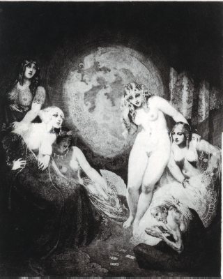
Norman Alfred William Lindsay was a very talented artist who lived from February 22, 1879 to November 21, 1969. His work ranged from profiles, to sculpting, writing, cartooning, and scale modeling. Lindsay is to this day seen as one of
Lindsay has many different etchings that he created through out his life. However, there are only a set number of prints created from each plate; each one certified by a stamp to prove it is an original print. The print that caught my attention is called “Beauty’s Fortune.” The majority of Lindsay’s prints are of nude women. In this etching, there are five beautiful women with an aged, not as lovely women sitting at their feet. Not knowing a great deal about this etching, I would assume that the artist is trying to portray the desire that women have who feel they have lost their beauty with age through the sitting woman and the unpublicized notion that women of beauty have more power. The seated position that the older woman is in looks like that of someone who is submissive or of lesser power. However, after closer inspection of the etching, it looks as if there are cards in front of the woman sitting on the floor and the other women seem interested in what she is doing.
The etching is very well done which is obvious for many reasons. One aspect of the etching that stood out to me was that the “beautiful” women were all lighter tones and pressed forward from the darker background. The woman sitting on the ground, however, has a much darker tone, making her skin look wrinkled and aged. Her hair is lighter, portraying that she is older with white or grey hair. The bright tone on the other women make their skin look flawless and tight, a clear sign of youthfulness.
As for the background, it is difficult to tell what it is. It looks similar to a globe of some sort. Or it may be wallpaper or a reflective window. The darkness of the etching makes the room look overall dimly lighted, again making the “beautiful” women stand out.
I really like this etching as a whole. I feel that the tones allow the image to look more realistic than something that has a flat tone. The contrast of lights and darks captures the viewers attention. I believe that Lindsay got his point across, even though the way I interpret the etching may not have been what he was going for exactly. The etching leaves room for interpretation which I believe is important in artwork.
Wednesday, February 4, 2009
The Party Animal

I stumbled upon John Dawson's work while simply "Googling" different types of intaglio etchings. I noticed that some of his etchings were quiet detailed, while others carried a simple image but a strong impression was made on the viewer. Dawson actually attended Northen Illinois University where he obtained a bachelor's degree in Fine Arts and then went on to further his education. Another thing that caught my attention was that he specializes in "works of fine art which are personal, perceptive, and psychological." Most of his works consist of people and are etched onto zinc plates and then printed individually onto paper.
The image shown here is entitled "The Party Animal." This is the first image in the series "Hobby Horse Men" that caught my eye. I feel that Dawson capture the expression on the woman's face with using only suggestive lines for her eye that would be visible. He also uses limited areas of shading, still allowing the woman to look realistic in a way. I believe the best part of this print is the drastic contrast in darks and lights. Dawson truly makes your eye move around the page to examine the dark and light shadows that exist on and around the woman.
I also enjoy the way Dawson made the dress look so realistic. It is obvious that this woman is wearing an elegant, expensive dress with a great deal of material. Again, the contrast of lights and darks, along with the overall preciseness of the lines make the shall or scarf look crumpled up around the woman's arms. However, Dawson also uses shape, edgy lines. This could be due to the image he is portraying or the type of work that this is. The stiff lines almost give the woman a sort-of stiff look overall while she holds her nose up in the air as if that is the way she is feeling.
The part of this work that I like the least I would have to say is the background. Although the technique looks interesting, I do not feel that it suits this woman. It almost feels like she is this elegant woman who loves to go out and enjoy herself, while she seems to be in a dreary, dungeon-like background. However, this may be the feel that the artist was going for so if it is the message he is trying to send, the background works.
Overall, I enjoy this work and feel that it is very well done. I think that the print is very clean-cut and percise. This is the same for the other works of Dawson. None of his works are extrememly detailed, but they are very well done. The all encompass a great deal of contrast with shadows and shading which make the images pop out at you.
Thursday, November 13, 2008
Dance Me to the End of Love

I have currently found myself admiring the work of a Scottish artisit, Jack Vettriano. I feel that his works do a great deal of capturing emotion and expressing it through the painting. Many times, I believe that people say that paintings capture emotion and I do not see it. I see it through Vettriano's paintings though.
Vettriano received a set of watercolor paints from his girlfriend and found his artistic talent at a young age, but did not feel that he was ready to show his paintings for a great amount of time. The first time he showed his work, both paintings sold on the first day and many other galleries were eager to showcase his work. It was in 1999 that Vettriano's work came over seas and was shown in New York. Many critics say that his work is unimaginative and sometimes vulgar, which I can see people saying that about some of his paintings. A few of Vettriano's works are very sexual, but do capture the emtions, feelings, and thoughts that are in the moment the pitcure portrays.
My favorite painting by Vettriano is titled "Dance Me to the End of Love." This is a watercolor painting that I believe is so intriguing. The overall design of the painting seems simple; however, Vettriano's portrayal of the couple dancing in what seems to be a moonlight atmosphere cannot make you feel anything than butterflies in your stomach, similar to the feeling you get at the end of watching a very good love movie. The couple appears to be dancing in puddles, which reflect their movements.
Although there are two other couples in the painting, it appears that the couple in focus is so infatuated with one another that they do not have another care in the world. Although this painting may look simple and encompass a simple idea, I still feel that it has a great amount of emotion radiating off of it. This goes for the rest of Vettriano's paintings as well. Vettriano also uses few colors in this painting, depicting a grayish tone throughout it.
In some of his works, critics say that Vettriano depicts males as "the predator" and I would probably agree on some of his works. However, this painting is one that displays the love of a man and woman through dancing. They are not shown dancing in a ballroom or at a party with a large amount of people, but instead it is more serenely portrayed that these two people are meant to be together. The only aspect of this painting that bothers me a little bit is I feel that the way the woman's arm is painting, when looked at closely looks almost too short for her body. This can be viewed a little distracting, but other than that I thoroughly enjoy the painting as a whole.
Thursday, October 30, 2008
Going GREEN

 For this particular blog, I was having some trouble coming up with an idea of what to write about. Thanks to Google, I stumbled upon an awesome website that posts pictures of designs that are innovative and functional, but use things that might be thrown away otherwise. It is called "Inhabitat" and was started by NYC designer Jill Fehrenbacher. Her goal was to "search for new ways to improve the world through forward-thinking, high-tech, and environmentally conscious design" (www.inhabitat.com). The designs pictured immediately captured my attention because of the fact that I had no idea what half of the designs were constructed of because they were so well done.
The first design that caught my eye was a chair. Although the design of the chair seemed quite simplistic and modern like, the inside of the chair was filled with old, rolled-up newspapers for support. The newspapers themselves provided functional form as well as stability in order to keep the chair comfortable and supportive. The chair has sharp edges, not rounded like a nice, squishy chair, but it does serve its functional purpose. The use of the old newspapers was an excellent idea since so many people today get the daily paper and then immediately throw it away, sometimes without even reading. This gives a use to those old newspapers that would otherwise turn into the waste that is polluting our earth.
Another design that I found to be quite hideous but fascinating was an inflatable chair full of garbage. The top part of the chair was full of empty plastic bottles. In the bottom portion of the chair, there were old nylons, a flipper, old paper and cardboard, old plastic and more. I would never put this chair in my house, but I believe the concept of the chair is a great idea. I think this design would have been much more appealing if the designer stuck to trash in a similar color scheme or of a similar family, for example if the bottles were used through out the chair. The idea as great because so many people throw away tons of things every year when it can be turned into art to make a statement or it can be saved and designed for use with a functional purpose.
As for the next design, at first glimpse, I could not tell what the skirts that the two girls shown were made out of. I then realized that they were made completely out of white, plastic spoons! The skirts were put together so intricately that it was difficult to tell that they were not made out of normal skirt materials. The designers of these skirts also make tote bags out of old billboard banners. They are very colorful and functional bags that can be used for everyday use. The group that creates these designs is TOUCH. They work with recycled products to make bags, skirts, and such for women.
I think that designs that can come from recycling products are great. With all of this "going green" talk, it is wonderful to see that the design world is taking it seriously. Hopefully, other people may come to terms with this and begin taking a second thought before throwing certain things away. It is true and proven through these designs that one person's trash is another person's treasure!
Thursday, October 16, 2008
IKEA


Now the world’s largest manufacturer of furniture, IKEA is an empire in home furnishing today. Originating in
The designs sold by IKEA are modern and practical, yet still encompass a great deal of style. The idea that products are flat packed, meaning they are all packed in a box somehow, allows for easier transportation by the purchaser. This is also convenient for people who may use public transportation to get around which allows them to purchase the furniture they need without having the burden of worrying about how they are going to transport it. IKEA allows everyone the opportunity to obtain realistic, durable, new furniture to suit their needs while maintaining a stylish appearance.
One of my favorite sections to go into when I go to IKEA is the children’s bedroom section. There are so many creative designs when it comes to the beds, dresses, storage, lamps, basically anything you could think you would need for a bedroom. One of the most intriguing children’s bedroom design I saw is called Mammut. It is this very basic, yet almost cartoon like furniture that you feel like would be seen in a Disney movie. All of the designs in Mammut have wide-bottomed legs and rounded features. The roundedness adds the cartoon-like feature to the furniture. There are also very simple colors used; only blue, red, and pink shades for all of the styles. Although this furniture is easy to grow out of, it is still very unique and captures the childhood spirit.
Another aspect of this furniture that I find very appealing is that it may be recyclable depending on the recycling rules of the community. It is made out of mostly wood. The furniture is also very simple to take care of because all that is necessary is for it to be wiped clean with a damp cloth. I believe this is great for children because they tend to be messy and it would be difficult for a parent to become angry if the furniture got dirty because all they would have to do is wipe it off.
The furniture is also very practical for children. There have been many cases of furniture falling on children which is a parent’s nightmare. This furniture is small and lightweight, which means that the child will be safe when around it. The design also may help teach the child about responsibility and having a clean room. It is easy to take care of and has a very simplistic structure.
The simplicity and realistic aspects of this children’s furniture makes it very practical. It is also stylish furniture that even though it can be grown out of, it is not costly enough to make it pointless to purchase. The fact that it may be recyclable is also a benefit. It will also be easy to transport and set up because of its flat packaging. Overall, I believe that IKEA has some amazing design ideas. It is easy to get consumed in the store because of its endless possibilities for decorating and furnishing a home.
Wednesday, October 1, 2008
CoAcH

Every girl has something in their life that makes them feel special, whether it be as commercial as make up, shoes, purses, jewelry, or something memorable like a family heirloom. Growing up in a household of six, money was somewhat tight. My sisters and I grew up knowing that there were certain things that we would not even consider asking our parents for, but that did not keep us from looking at those things. For me, Coach purses have always been one of those things. Although they can be quite pricey, I have always thought that they are very fashionable. I also loved the fact that they are covered in the letter “C,” which as a child I was intrigued by since my name also starts with the letter “C.”
It was not until my high school graduation that I received my first Coach purse from my aunt in my favorite color, blue. I can remember opening up the gift bag and seeing the word “Coach” across the box. I was ecstatic, even though I am not the materialistic type. Inside every coach product comes a little booklet that gives a description and history of Coach. After reading this booklet, I began to like Coach even more. The Coach Company began with a small family business. The purses created were modeled after the leather that was used on baseball gloves. The gloves became softer and softer with every catch, which was the beginning of a whole line of designer handbags. It is somewhat ironic that out of a man-dominated sport came an idea for purses for women that have made over millions and millions of dollars.
The design of Coach handbags has remained almost the same since the first bags were created. Coach is known for their durability and practicality. The design acknowledges the functional purpose of the purse while allowing a woman to feel lady-like and classy. Coach purses usually have many pockets and compartments inside of the bag in order to make organization much easier. As the company grew, so did the variations of handbags. However, Coach made sure it continued to create bags that were functional and elegant. They also continued the use of the soft leather they used from the idea of baseball gloves. The fabric and design on Coach purses is also unmistakable. The simple design of repetition of the letter "C" is a signature of Coach. It is the simplicity that makes the designs of Coach so distinguishable.
There are three types of Coach bags: in the hand, over the shoulder, and across the body. In the hand consists of clutches and such that are “grab and go” type purses. They are small, yet serve their purpose. Over the shoulder is the more common type of purse for everyday purposes. These include the hobo bag, crescent bag, as well as the basic purse types. Most of the over the shoulder purses include a great deal of extra room for a woman to carry around all her basic needs. A benefit of the over the shoulder bag is that it can be used for everyday or it can be used for special occasions depending on what a person is looking for out of the bag. Lastly is the across the body bag. This is a smaller purse with a long strap to sit on the shoulder, go across the body, and hang the purse on the opposite hip. This design includes many pockets that are great for putting cell phones, keys, or wallets into. Although it is not as large as the over the shoulder, it still has a very functional purpose to it.
Overall, I believe that Coach purses provide a functional, yet elegant design to the purse world that sometimes is forgotten. A purse is an accessory that can complete and outfit. Although many women will settle for a plain, simple bag that they use every single day without a care, it is nice once in a while to have the option of having a classier, more sophisticated looking bag. I am guilty of just grabbing a purse and going, but every so often I like to use my Coach purse to spruce up my outfit. I love the fact that the design of Coach purses incorporate functionality and sophistication. Although there can be a large price tag on some Coach purses, in the end it seems worth it.
Thursday, September 18, 2008
Camille Rose Garcia


In high school, I had an amazing art teacher for three years who taught me a great amount about art and how to build on the small amount of skills I had. My teacher fit the stereotype of an artist that many people have today: pierced nose, multiple tattoos, dark-dyed hair, but we all know that this stereotype is usually untrue. Her class was extraordinarily interesting because she focused on so many different types of artistic styles and techniques. One artist that we studied who caught my attention was a woman by the name of Camille Rose Garcia. Born in
Probably the most unique part of her work is that she uses cartoon-like characters to depict her political topics. The characters she uses resemble many famous fairy tale characters. Her inspirations came mainly from “Walt Disney, punk bands like the Dead Kennedys, and sci-fi writer Philip K. Dick (www.sjmusart.org). Garcia grew up in
A key aspect in Garcia’s work is the muted colors she uses. None of Garcia’s paintings use bright, stand out colors. The tones seem to be dark and add almost gloominess to the work for lack of a better word. Garcia also uses many significant shapes within her work. It is common to see tear drop shapes in the background of her paintings to portray the somberness and seriousness of the issues that she is trying to capture from the audience. Another common aspect is the dry-brushed background over wallpaper. Garcia uses this technique to maintain the childish, yet mature them of her paintings. The wallpaper tends to have repeated designs or images which almost resemble what may be in a child’s room, but this aspect of the painting remains subtle as it is painted over. Garcia also uses a lot of cloud-like images and other things that would be common fairy-tale like images.
Many of Garcia’s works can also be seen as disturbing by some people. There are many images in which there are cartoon animals with their heads cut off, or creepy faces that almost look like they are staring at you. Although all of the characters in the paintings seem creepy, they still have a cuteness to them. They have unusually large heads extremely long arms and legs. Garcia does an amazing job of creating the fairy tale fantasy with a creepy twist.
One of her works that I remember caught my eye but I could not find online was a painting she did of Little Red Riding Hood. Instead of the story about the little girl who is trying to visit her grandmother’s, Garcia turned it into the imagery of a young girl who is coming of age. The girl in the painting is around the age of a girl who would begin menstruation, explaining the color red. The wolf, however, portrays men who try to simply take girls’ innocence. Even though some people may view this as a disturbing twist on a childhood fairy tale, Garcia uses the story to display a real issue in society. I thoroughly enjoy Garcia’s art, even with it’s “creepy” nature.
Thursday, September 4, 2008
Cloud Gate

Commonly referred to as "The Bean", Cloud Gate captures the beauty of the elaborate skyline in downtown Chicago. Cloud Gate was designed by the artist Anish Kapoor and is strategically placed in Millennium Park. Although there are many works of art in Millennium Park, Cloud Gate is the largest work of art in the park. It is said that Kapoor found inspiration for this work from liquid mercury. Many people refer to this work as "The Bean" because of its bean-like shape. When looked at from a distance, Cloud Gate actually resembles a massive, silver bean in the middle of the park. However, when viewed more closely, Cloud Gate reflects not only the buildings and architecture that make Chicago the magnificent, but also the sky and natural beauty that surrounds it.
I have visited Cloud Gate multiple times through out summers of spending time downtown. At first, the sight of Cloud Gate made me somewhat nauseas. The reflection and distortion of the surroundings up close were somewhat difficult to get used to. However, it was not long before I realized the beauty of this simply shaped object. It is sometimes easy to look at a work of art and be judgmental. I originally was unhappy when I saw Cloud Gate because so many people made a big deal about how fascinating this work was. After observing Cloud Gate from a distance and up close, I realized that it must have taken a great amount of planning in order to create the impression that Cloud Gate leaves with people.
Cloud Gate displays a very futuristic type of art. The work is not something a person sees everyday. It is composed of many steel sheets that were placed together and then polished to resemble unity in the artwork. It is almost mystical in a sense because of its shape and extremely shiny composition. One of the best aspects of Cloud Gate is that it draws you to it. No one can resist going up to Cloud Gate and exploring it with their eyes, hands, and even cameras. People spend a great deal of time trying to capture the beauty of Cloud Gate in a picture, but this is a difficult task. I believe that Cloud Gate is almost like a "gateway" to the city. The reflection of the buildings, people, and surrounding nature leaves visitors memorized. How can such a simple looking object be so mysterious?
It is also fascinating to think about how this great object was created. The design is simple, but the execution of putting this object together was very difficult. All in all, the total cost of Cloud Gate was over twenty-three million dollars! It was built on sight because it would be to difficult to transport the almost one hundred and ten ton work. I keep referring to the simplicity of the work, but the planning must have been extensive in order to develop a design that would capture the city as a whole. The design of Cloud Gate also allows for the artwork to be interactive in a sense. People from all over can come up to the work and touch it, and even stand beneath it.
I believe that art exists in everything. Things that are simple in design, like Cloud Gate, still encompass the ability to impact people simply through them viewing the work. Cloud Gate was an extensive project to complete, but contains a strong sense of simplicity. I believe it is Cloud Gate's simplicity that makes it such a wonderful addition to the city. When visiting the city, I also notice how everyone is rushing around, not paying any attention to their surroundings. I have never really seen people just stop in the middle of the sidewalk, look up, and absorb the beauty of the buildings and skyline. Cloud Gate allows people to view the beauty that they tend to miss. I would highly recommend going downtown and visiting Cloud Gate. It is a fascinating sight and a must see, even for Chicagoans.


Subscribe to:
Posts (Atom)